Sydney Contemporary
Bringing the art
to the people.
2018 — 2021

LOGO BY COMMON
Taking place annually at Carriageworks in Redfern, Sydney Contemporary is an art fair that features curated exhibitions and ambitious programming, appealing to everyone from the serious collector to the novice.
In 2018 I was invited by the fair to produce a design system that could be customised and rolled out across three future years while retaining the existing branding created by studio Common.
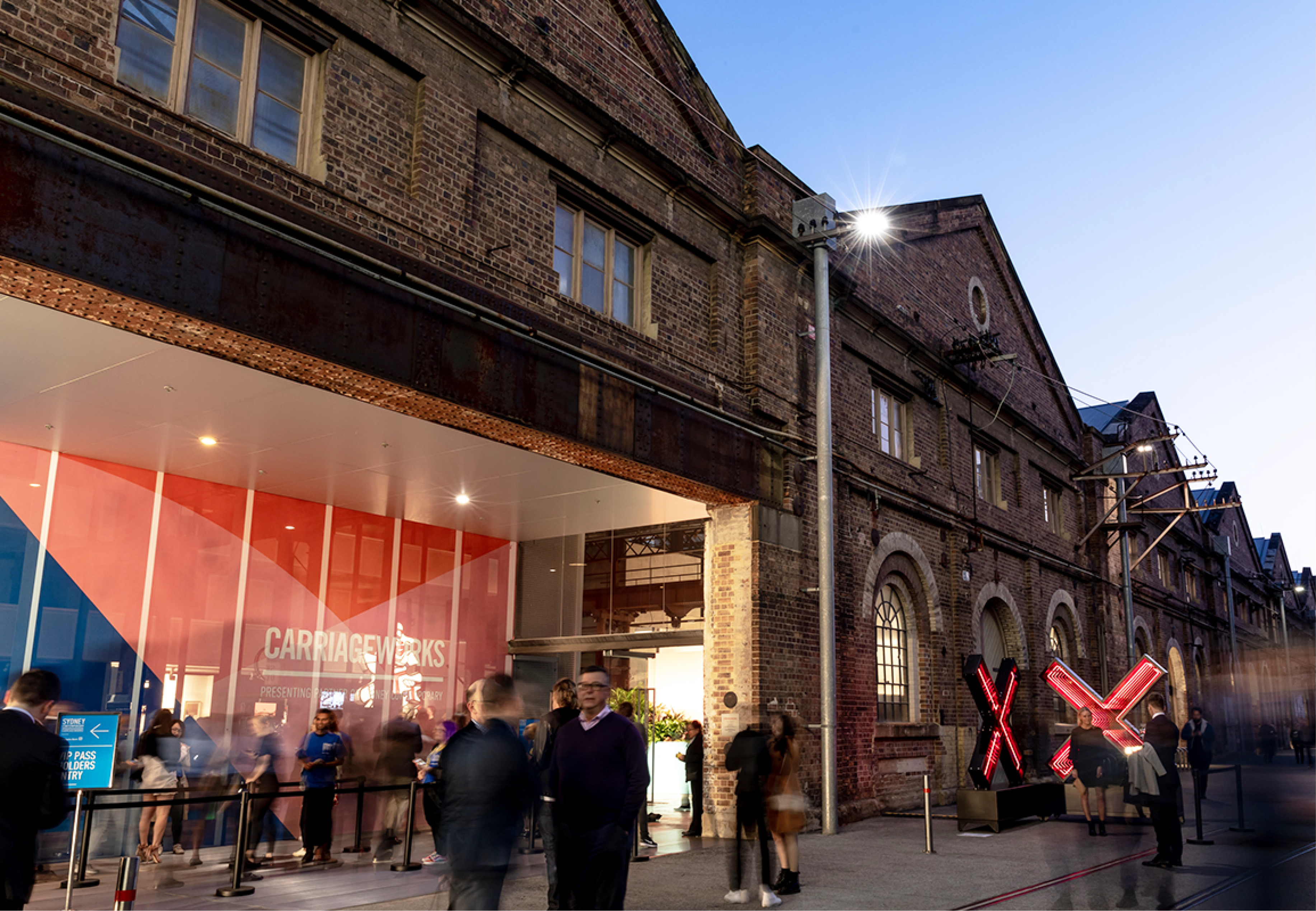
2018 external signage
With a thriving contemporary art scene, Sydney is a dynamic cultural destination with an international reputation for presenting the very best in visual art through its leading commercial galleries, public institutions, private museums, festivals and Biennale. Defined by the vibrancy of its host city, Sydney Contemporary provides collectors, industry professionals and the art loving public access to cutting-edge art from some of the world’s most respected artists and galleries as well as the opportunity to discover new, emerging talent.
Sydney Contemporary welcomes over 90 galleries from around the world and showcases the work of over 400 leading and emerging artists from more than 12 countries.
 2018 external signage
 2018 external signage
2019 campaign design update
Billed as one of the most celebrated events on Australia’s cultural calendar, Sydney Contemporary has established itself as a must-attend art event and the perfect place to discover and collect modern and contemporary art.

internal wayfinding

internal wayfinding
My initial concept was a bespoke geometric font that would display the year and be rendered in colours inspired by the city (eg. the harbour, for 2018) but this eventually morphed into a simple pattern featuring overlapping and blending palette. The idea was that this would allow for greater flexibility across the many campaign executions, would allow for an animated version, and could easily be adapted for future years.

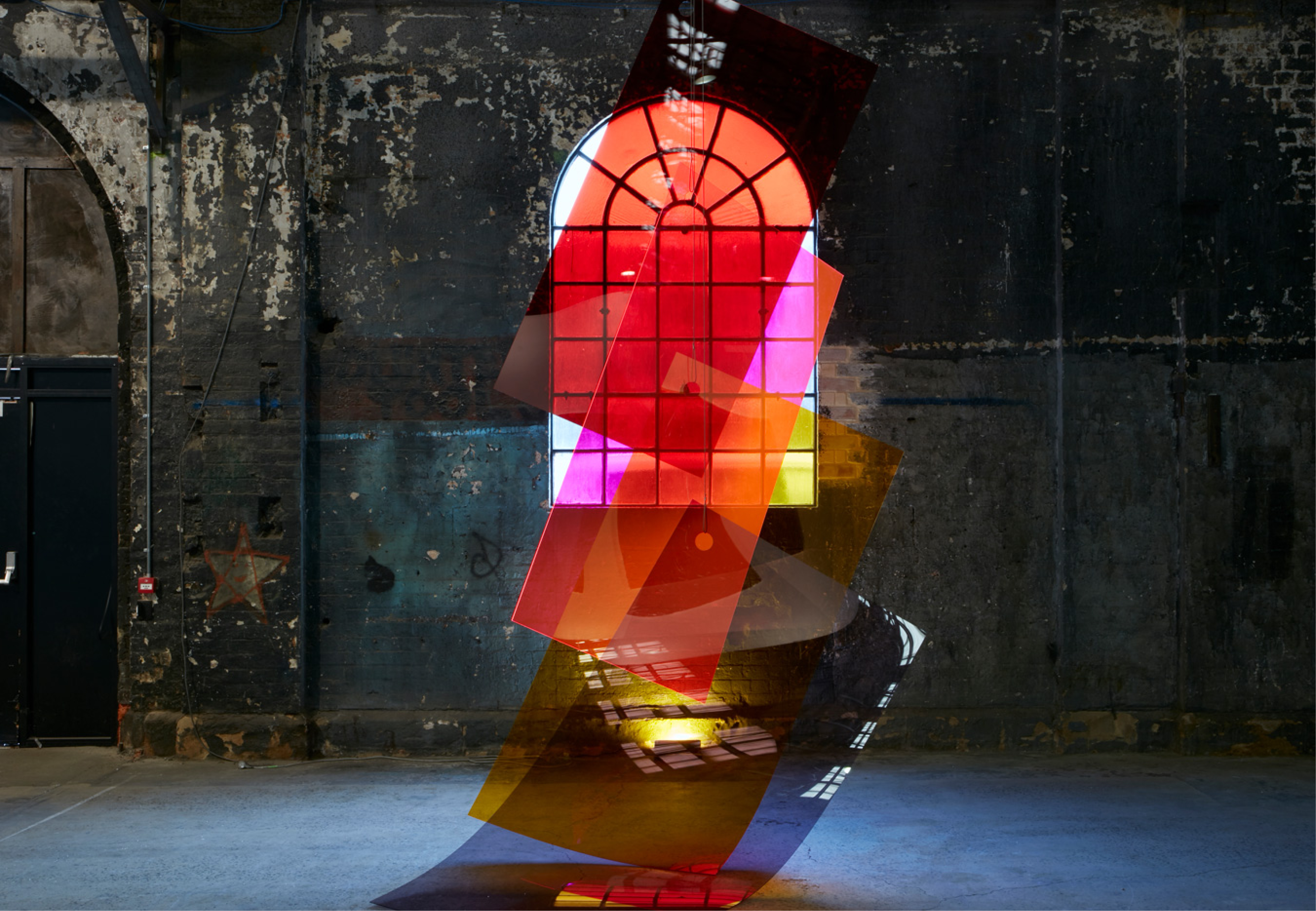
2018 campaign art
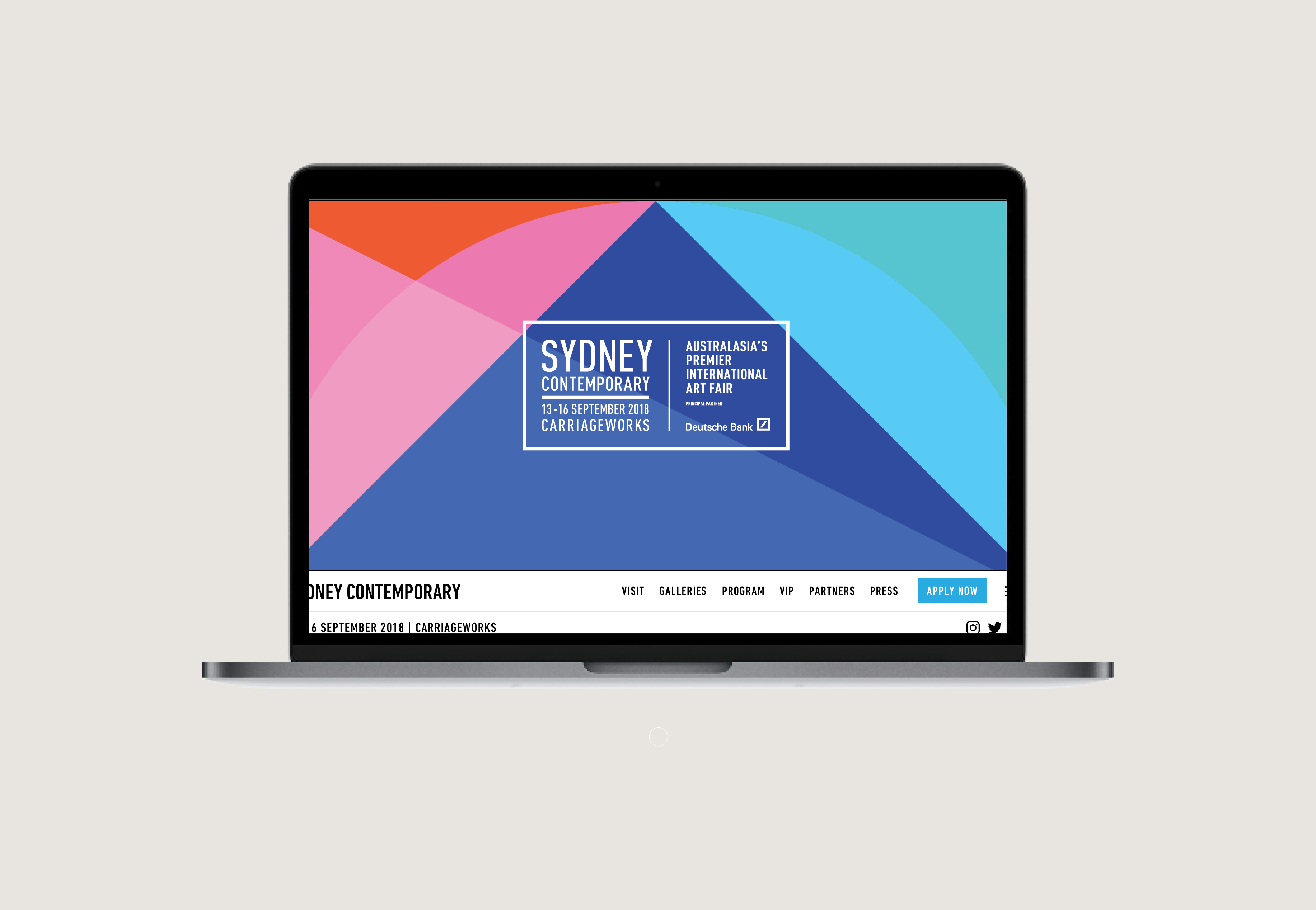
2018 website
2018 flyer

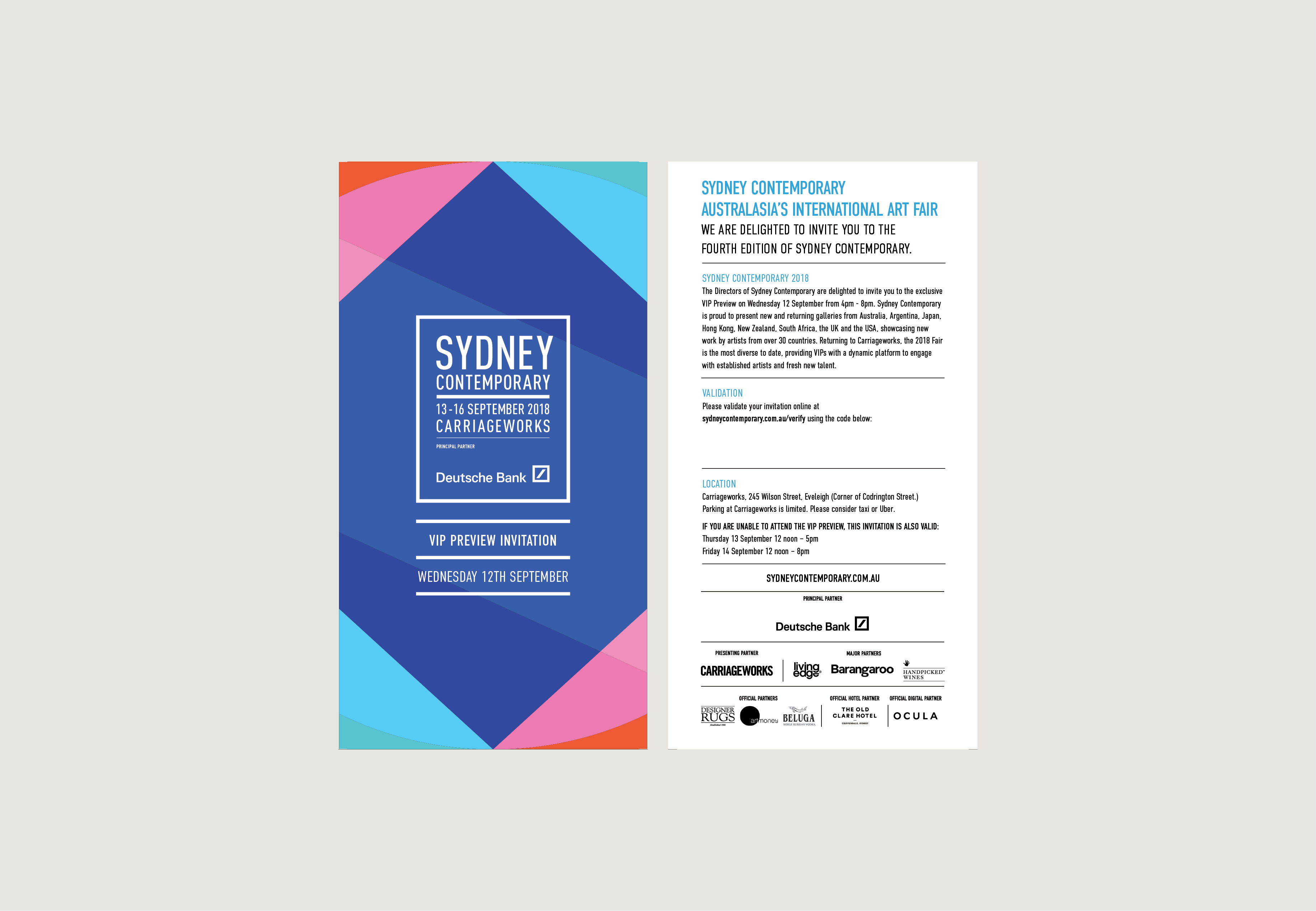
2018 tickets

2018 floorplan

2018 street flags

2018 advertising
sydney contemporary